Memories
Lead Designers: Bryant Hodson, Andrew Hair
Designers: Ryon Bazzle, Denis Modugno, Eliza Jensen, Josie Morris
Web Dev: Josh Crowther, Jason Allen, Chad Eddington, Derrick Craven, Joe Podwys, Trevor Adams
Product Management: Roger Bell, Todd Powell
Designers: Ryon Bazzle, Denis Modugno, Eliza Jensen, Josie Morris
Web Dev: Josh Crowther, Jason Allen, Chad Eddington, Derrick Craven, Joe Podwys, Trevor Adams
Product Management: Roger Bell, Todd Powell
They say that when a person passes away, it's as if a library burnt to the ground. Each individual on the earth has unique experiences and perspective—one-of-a-kind information that can't be found in a Google search. The only way to share these memories with one another is through storytelling.
Our team introduced free, straightforward, storytelling tools to help people share and preserve their memories in perpetuity.
Southern California Contextual Inquiry
We organized a cross-discipline team to travel to California and meet with current and potential customers to better understand how they remember, preserve, and share their meaningful memories. We discovered that there was a deep-seated desire for many adults, especially mothers, to capture and share stories. Usually this desire was triggered by a life-turning event and could often be debilitatingly overwhelming, so the method had to be so simple and already part of something that they are already doing for it to work.

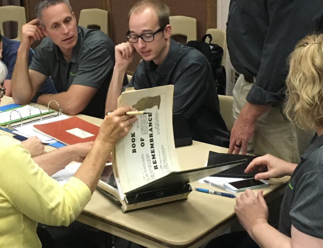
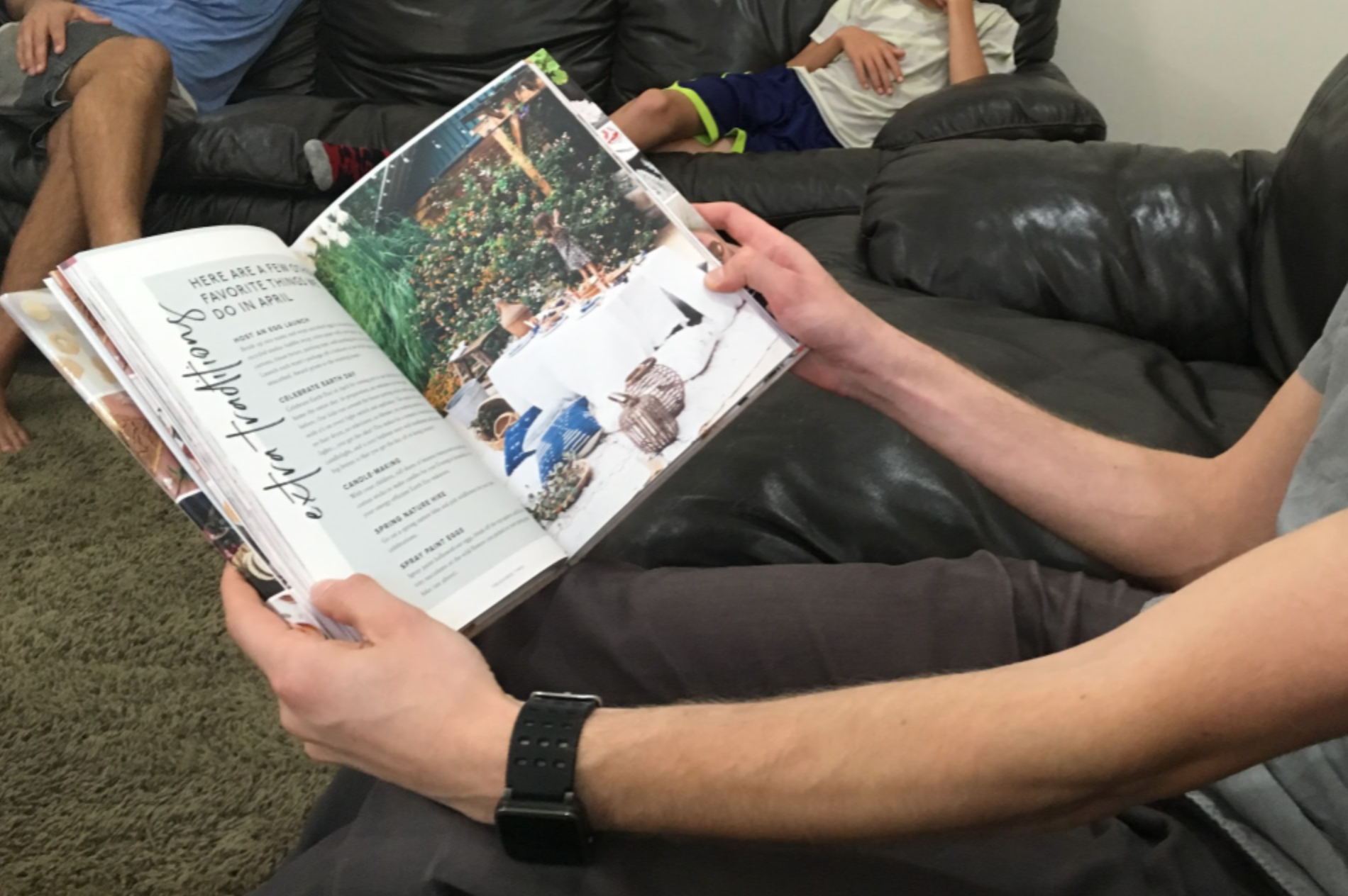
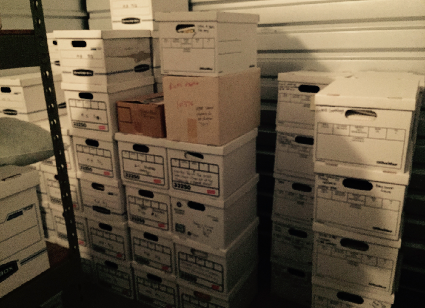
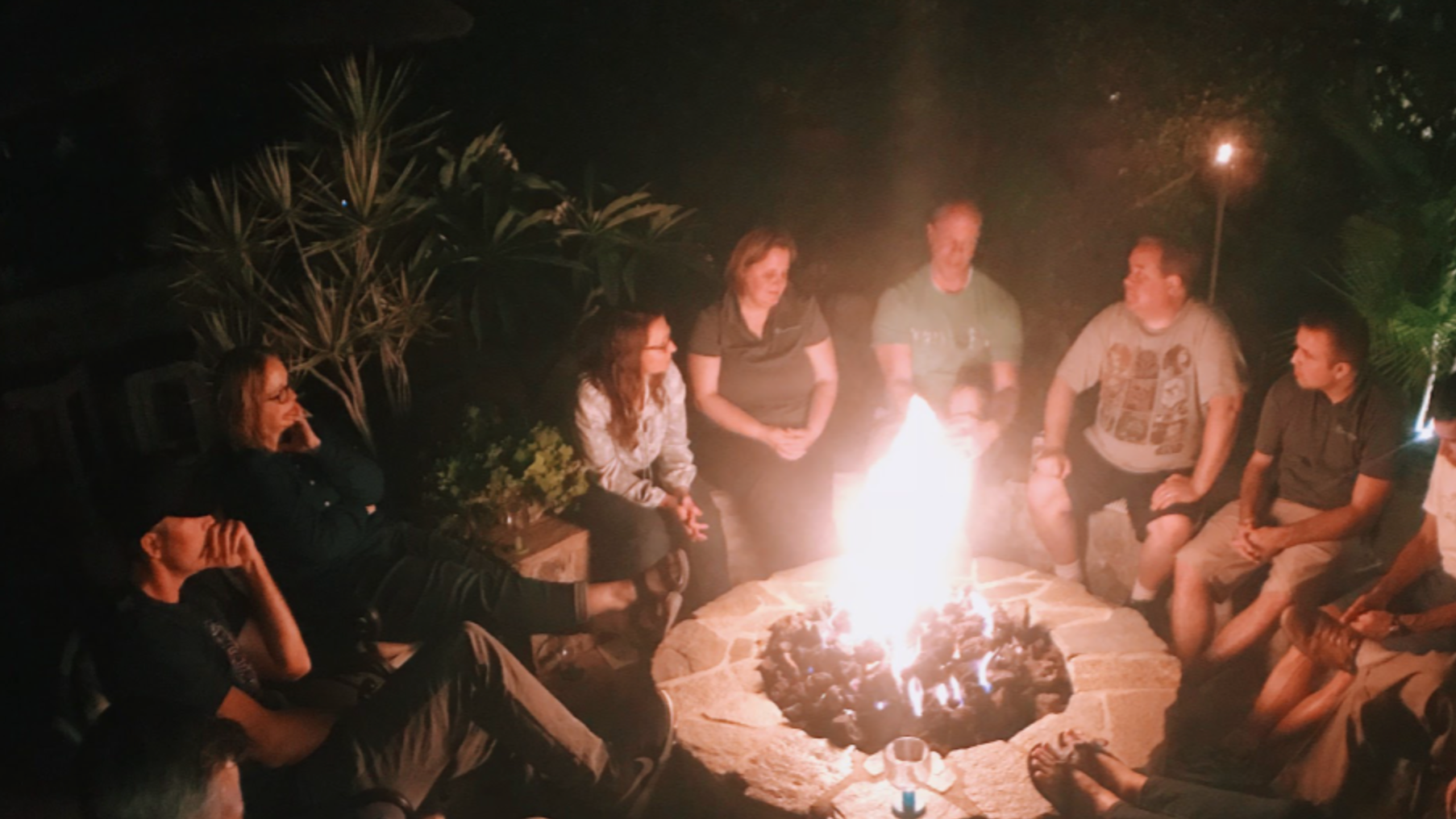
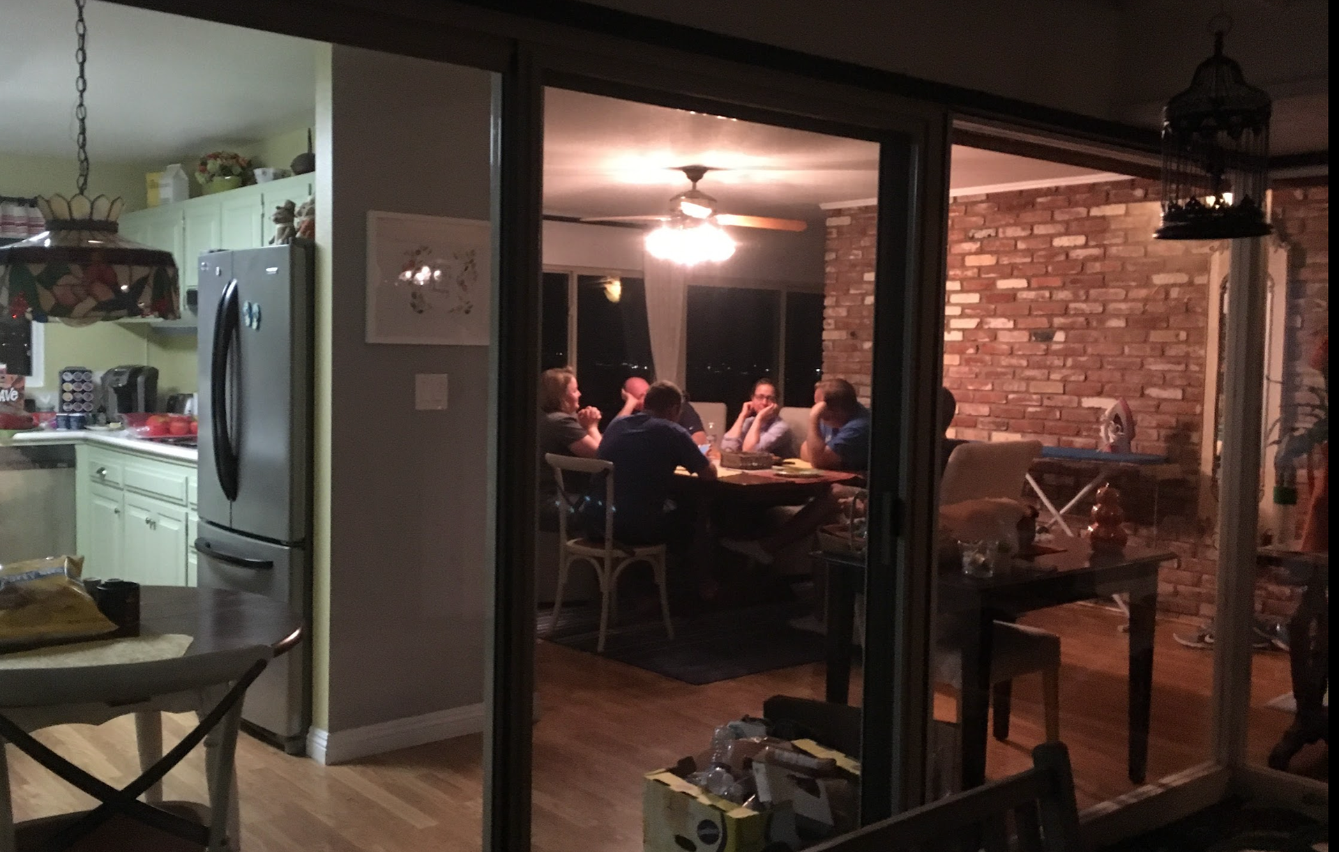
Building an affinity of snippets from the C.I. to better understand and tell the story of what we observed.
The Mother's Council
One of the major takeaways of the C.I. trip was the need to better partner with the mothers that are using FamilySearch Memories. We found that their voices weren't being heard loudly enough and they were an incredibly dedicated customer segment. We formed a mother's council that would meet with our team regularly, try experimental new activities and features, and they came back with wonderfully candid feedback. Their feedback helped shape our team's backlog and products.
Capturing Stories
Our goal and challenge was to help people create the best digital representations of their own memories. We believe that there are two key ingredients to this: Storytelling (words that are written or spoken) paired with "Memory Sparks" (artifacts that trigger memories and enrich stories such as photos, documents, places, recipes, and prompts).
Audio Recording
Not only can some personal stories be hard to 'put to paper', the value and rich detail of hearing a person's voice, especially a family member's voice, telling their story can be priceless. As such, we included capturing audio stories on the FamilySearch mobile apps as well as on the web app. Our aim was to make the feature studio-like, eliminating distractions and letting the storyteller focus on recalling the memory.
This feature was especially useful for capturing oral stories of tech-averse great grandparents and a way for small children to record and remember important vacations and events in their lives.
Adding to the Story
To capture a family's collective memories, it takes a family. We provided a way for others to add their remembrances and comments to someone's story.
The Gallery
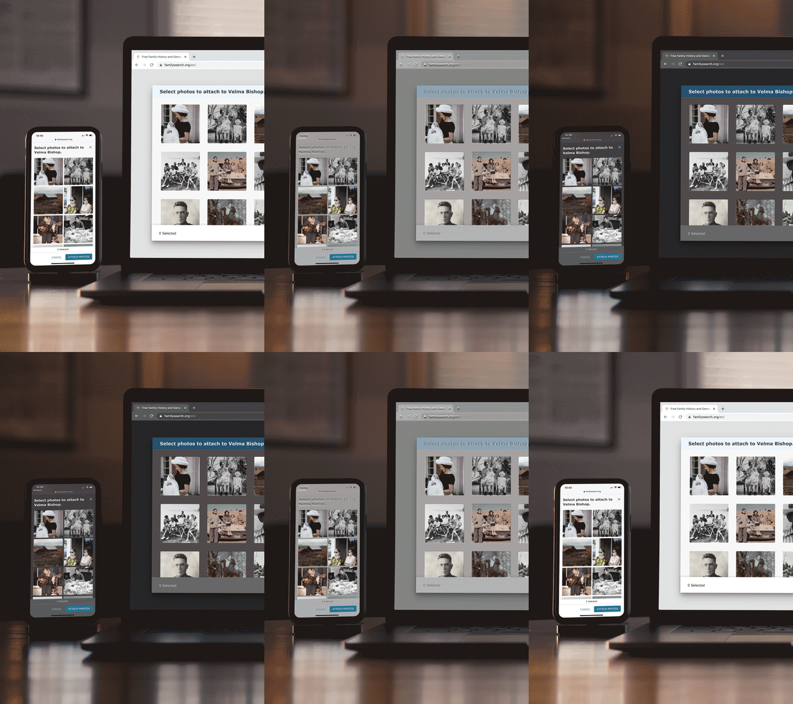
The Gallery was a complete redesign of an early version of Memories. We took the complicated and disparate pages of photos, stories, documents, and audio files and simplified the experience to a single page web-app. It made creating, enjoying, managing memories and albums much easier.
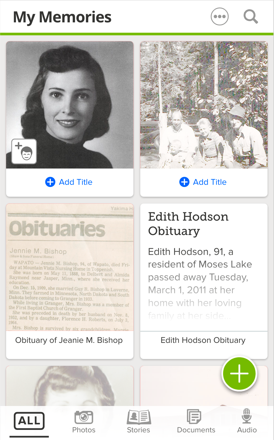
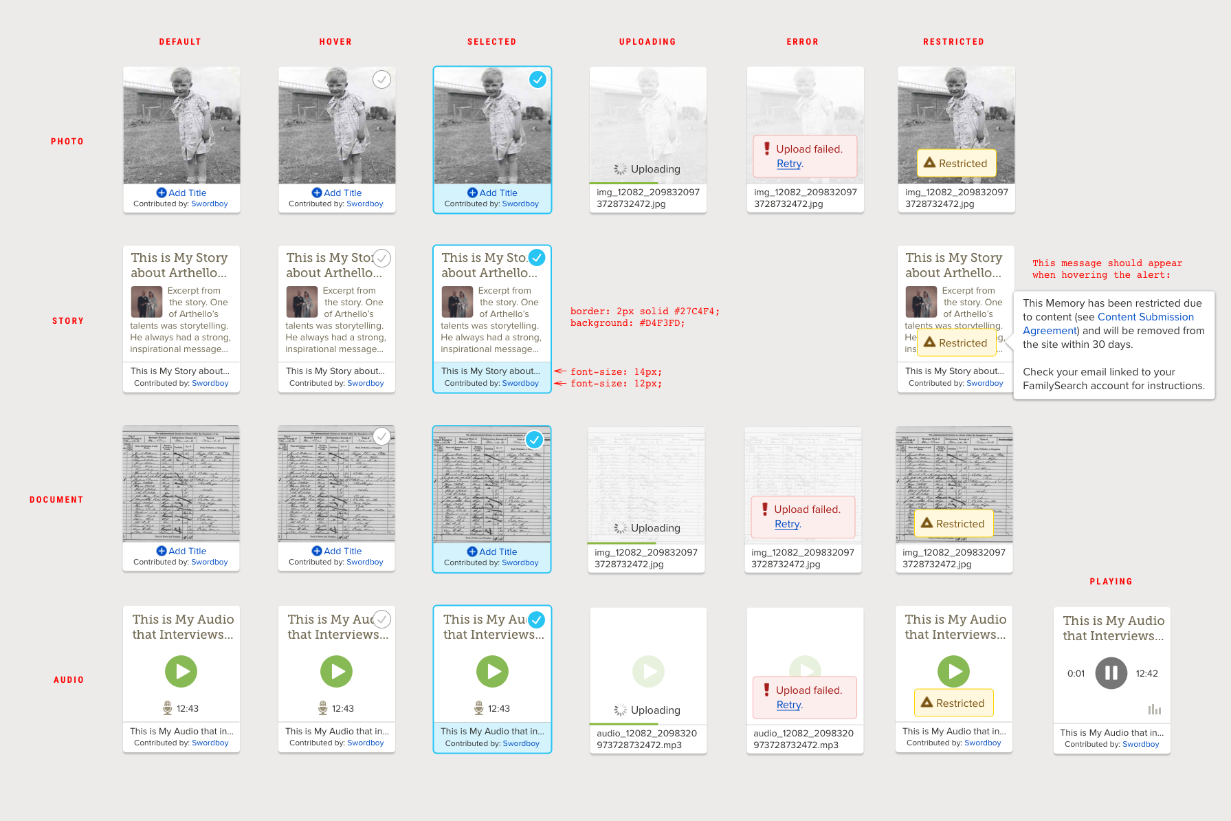
The matrix of memories card states
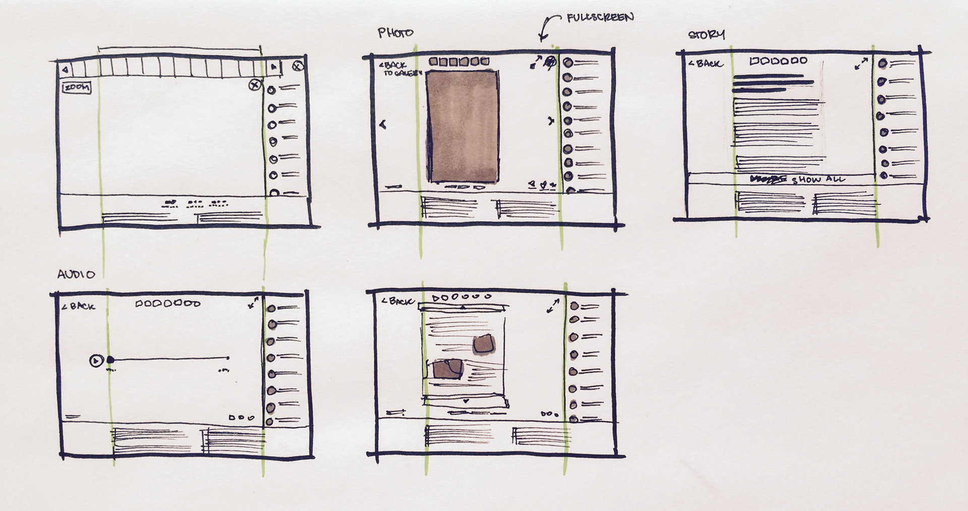
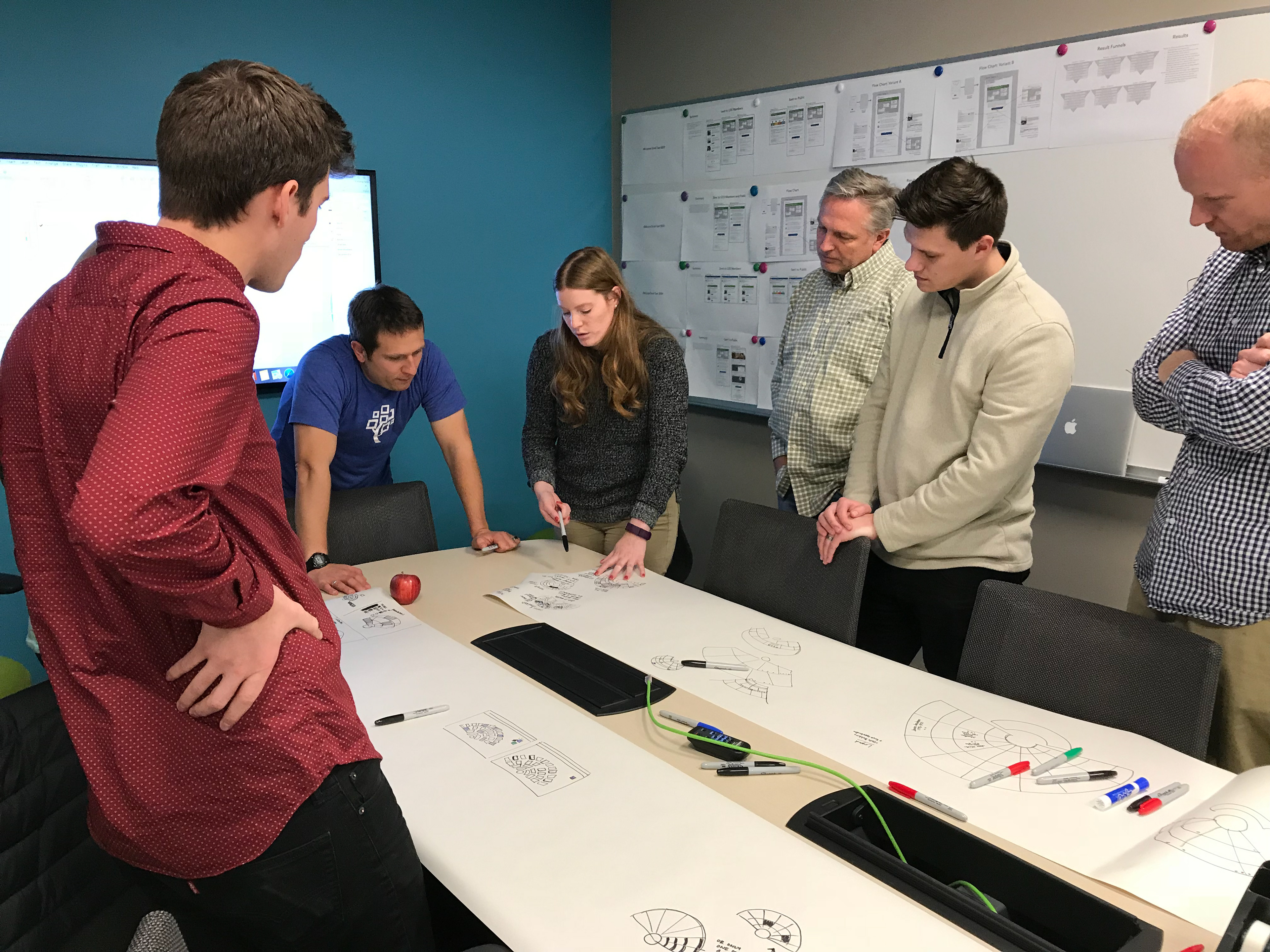
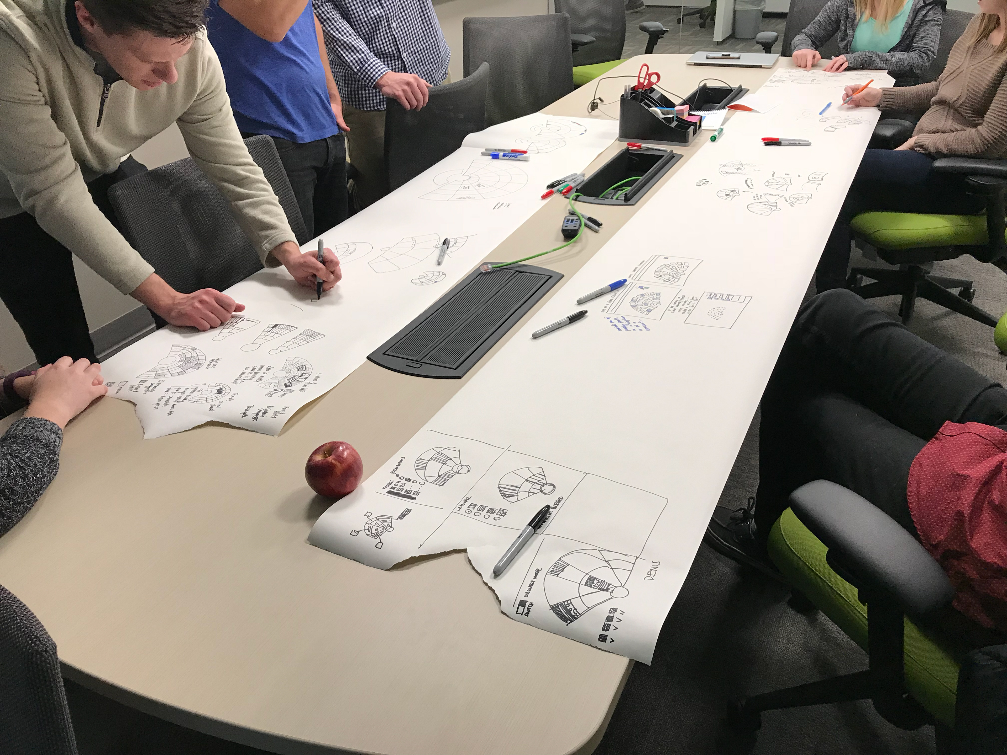
Wireframing on paper
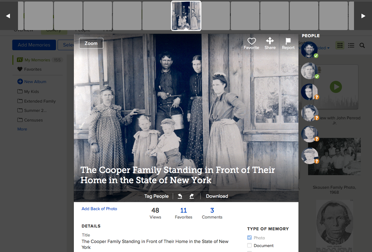
Memory page modal UI concept
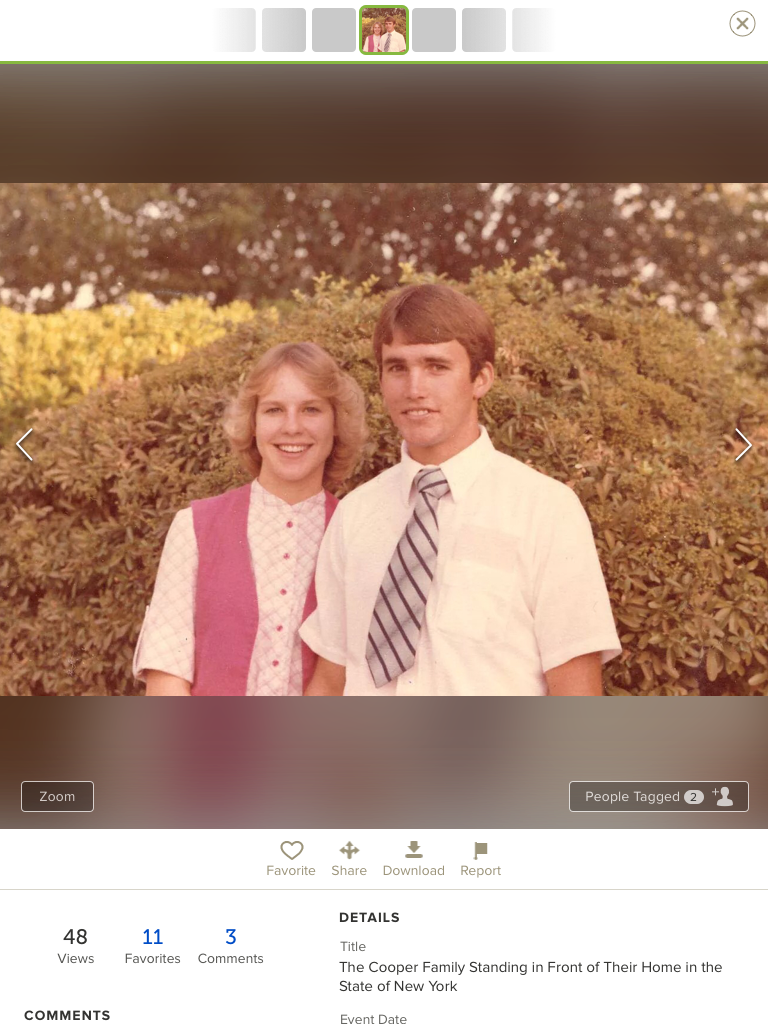
Memory page concept
Concept for empty state spot illustration
Process
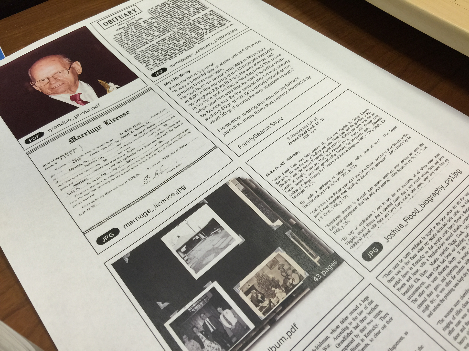
Card Sort cards to test content categories for Memories
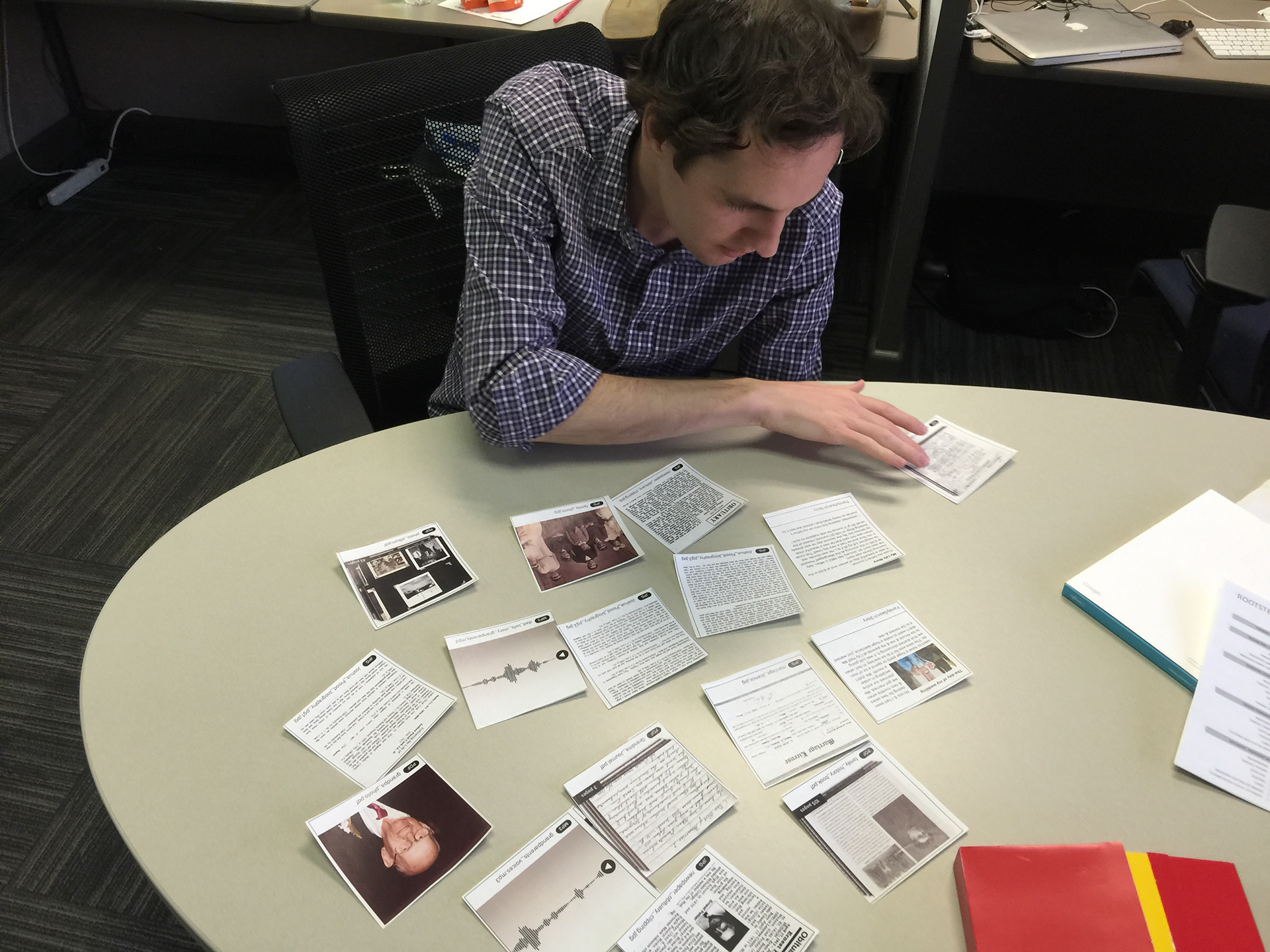
We ran an open card sort with several people
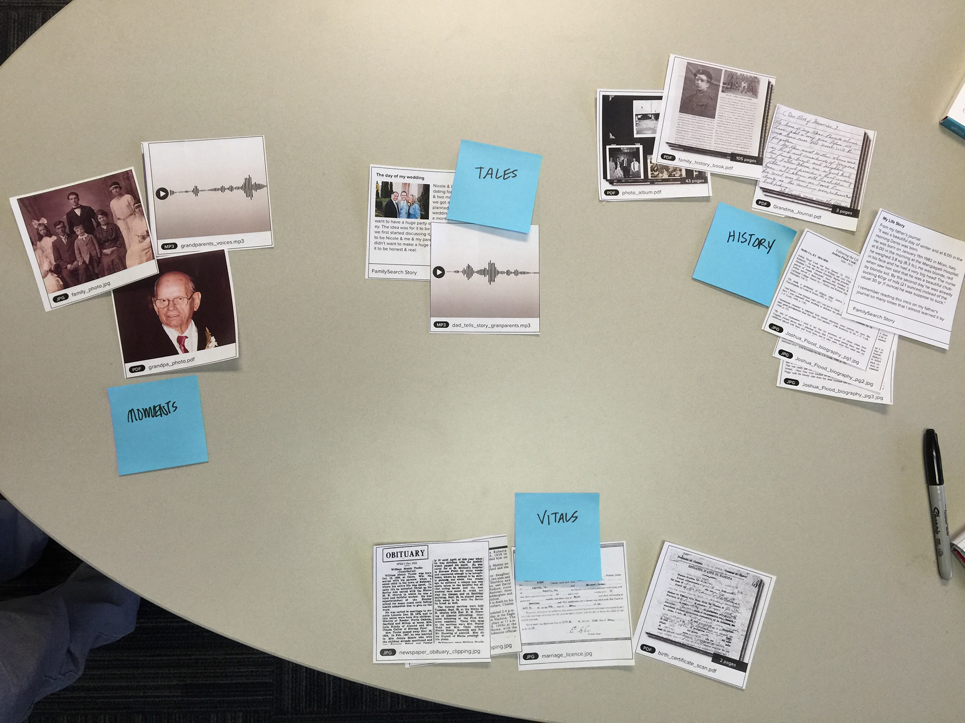
After sorting the cards, the user was asked to give a name to each grouping
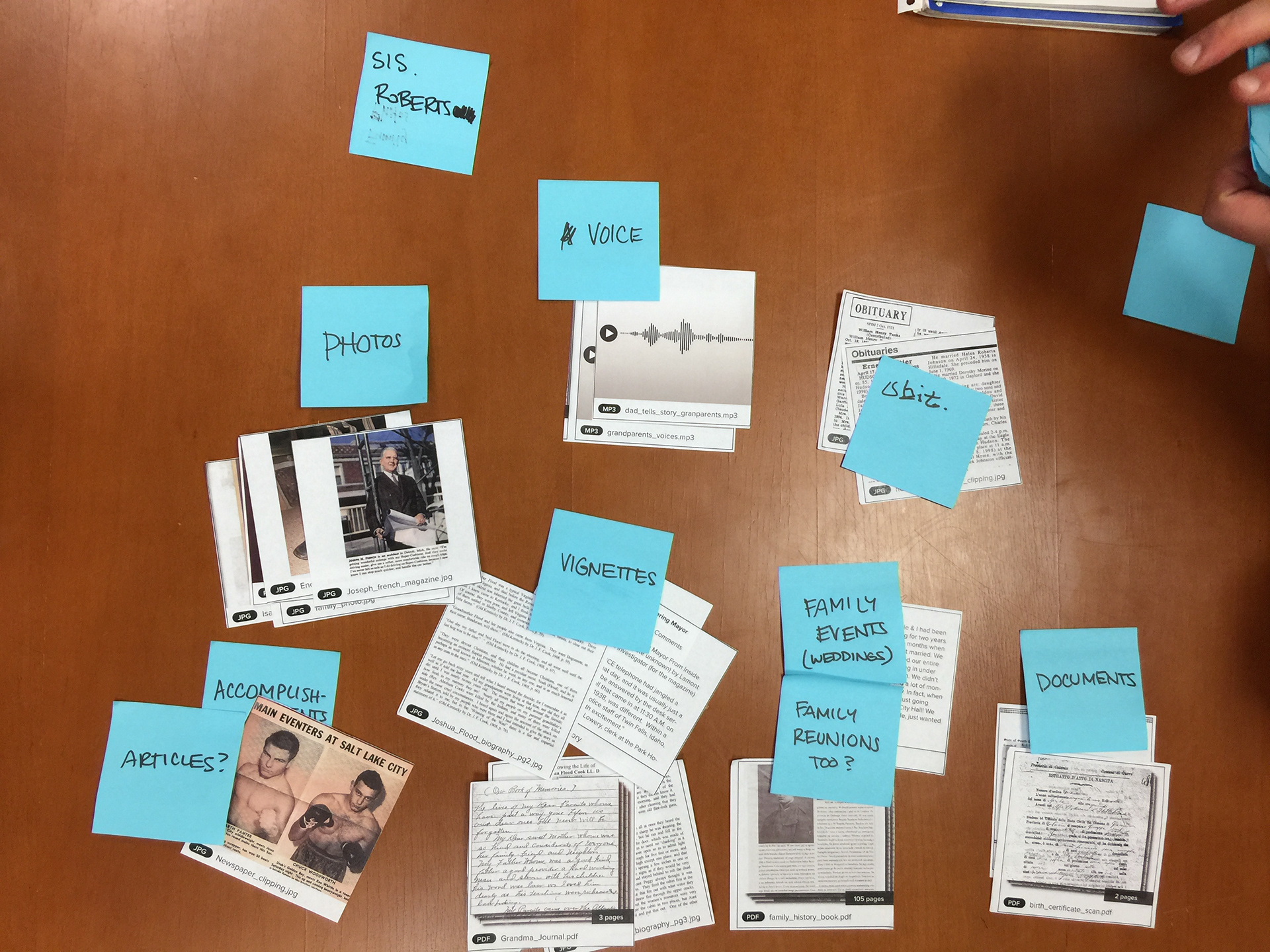
The resulting groups between users varied widely.
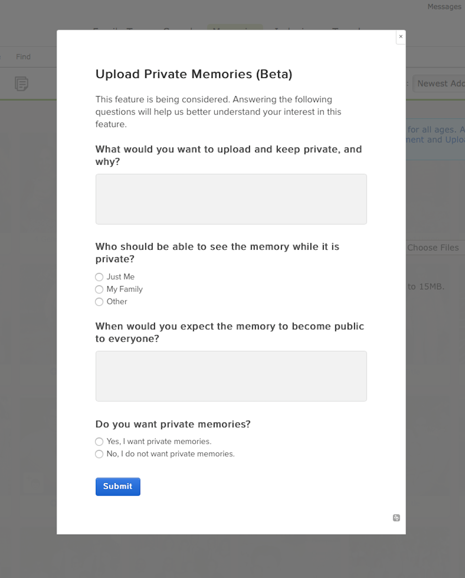
Memories were designed to be public by default. This is part of a survey we ran to understand the desirability and intent of private memories
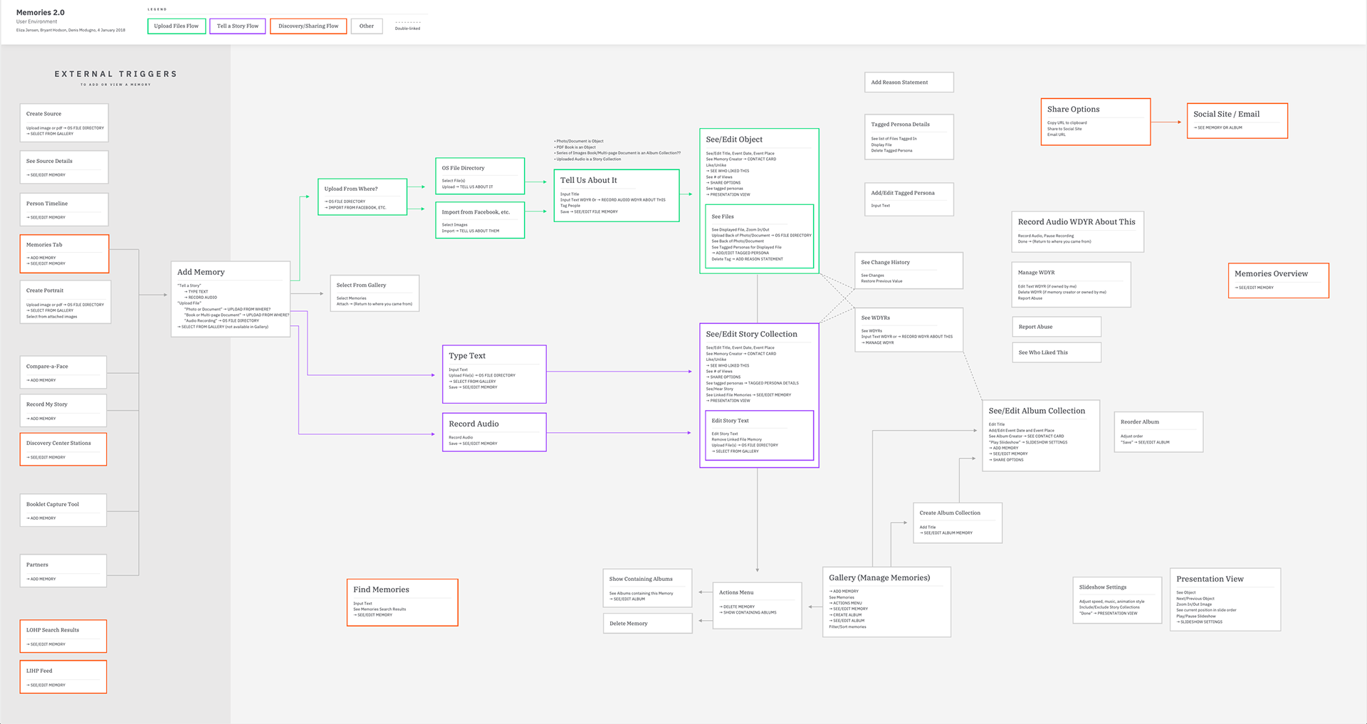
User environment diagram
"If failure is not an option then neither is success."
—Seth Godin, Stop Stealing Dreams
—Seth Godin, Stop Stealing Dreams
Some of our key learnings about how people would use the Gallery were uncovered post-launch. For example:
• The primary call-to-action for the Gallery is to attach the memories to their ancestors in their family tree. Attaching ensures that the memory isn't lost, the people mentioned in the memory are identified, and it is discoverable by other users in the family tree. To optimize this affordance, we ran a series of AB tests—narrowing it down one variable at a time (icon/word, then size/position, then color) to find the best design.
• We found that after users attached them to their tree, they would delete the memories from their Gallery, thus losing the memory and its attachment to the tree! Through user interviews, we discovered that they didn't really want to delete the memory; they wanted to hide it. They wanted the memory out of their workspace in the Gallery. To better support this intent, we introduced "My Archive". That way, they could hide the memory after attaching it without unintentionally deleting it from FamilySearch.
• Making memories private was a feature that was often requested, but through further research (surveys, interviews, etc), we uncovered that most wanted to have shared private memories, not memories that were private to only the owner. This insight helped shape our approach to the request.
Fan Chart
Designer: Bryant Hodson, Mark Gowans, Ryan Plumb
Product Manager: Roger Bell
Developer: Chad Eddington
Product Manager: Roger Bell
Developer: Chad Eddington
Because much of peoples’ family history is found in records, dates, and places, it can be a real challenge is to piece it all together to learn what it all means. The Fan Chart gives a person a birds-eye view of their heritage by color-coding birthplaces of their ancestors (similar to the data visualization that DNA results might provide) and research helps provide hints of new historical records that are likely about the user's family. A user can see up to 7 generations of their ancestry at a glance.
To make the feature more accessible, users that suffered from color blindness were asked to pick from a list of color swatches that they could distinguish. Those were the colors used in the final design.
Fan Chart showing birth countries of ancestors
Fan Chart showing the heat map of photos (i.e. where there are more photos in your tree or opportunities to find and add photos)
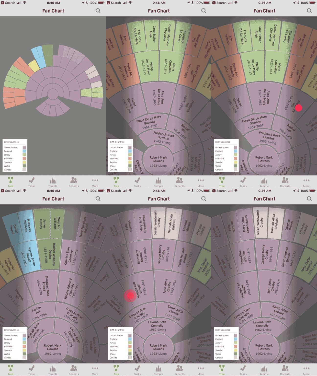
Mobile animation concept that I mocked up
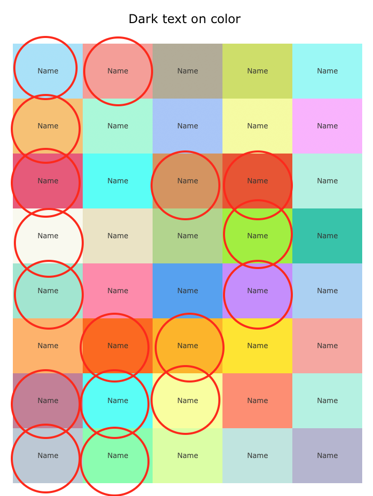
Testing color swatches for color blindness accessibility
Landing Page
To improve SEO and conversions, we tested and developed a landing page for Memories. It explains why to use Memories, what they are, and serves as a springboard to dive into relevant content and key features.
Ancestors with Memories
There are over a billion people added to the one world Family Tree on FamilySearch. Finding which of your ancestors has memories (photos, stories, documents) added to them can be a challenge. That's why we designed the Ancestors with Memories page that filters a user's tree to show a grid of their ancestors with attached memories.
This page was often the most heart-warming page for FamilySearch users. They saw the faces and names of their loved ones, known and unknown ancestors all in one place.
FamilySearch Jr. Mobile App Concept
1st Place — FamilySearch Engineering Hack-a-thon
Designers: Bryant Hodson, Riley Florence, Kevin Dewey, Eliza Jensen
Designers: Bryant Hodson, Riley Florence, Kevin Dewey, Eliza Jensen
Family history has historically drawn a crowd of empty-nesters and the elderly. However, studies have shown that young people that are familiar with their family’s history tend to be much more resilient, especially in times of turmoil. FamilySearch Jr. is a concept for a mobile app to appeal to pre-teens—helping them to unlock who they are and where they came from.
One of the concerns our team had when developing this concept was encouraging more solo screen time for kids, which could to be counterproductive to strengthening family connections. We realized we needed to design an app to encourage more face-to-face conversation with family members.
The basic loop is: Select an activity, do the activity offline to learn the principle, come back to the app and record their impressions, and unlock a digital experience that builds upon the principle they learned. Each activity builds in to a firm understanding of Who they are, How they fit in, and the foundational principles of Family History and the Gospel.
Although this project was a result of a 48-hour hack-a-thon event, activities from the app were tested with several children with very positive feedback from both the children and their parents.
During the initial launch we ask them a series of questions that they can answer using their microphone. We'd use speech to text to capture that in a formatted way. We'd preserve the original audio file as part of a time capsule for generations to enjoy (who doesn't want to hear their 11 year old grandpa).
The activities screen their first time in. The Time Capsule activity is completed during the Onboarding Process; after they complete the next two the rest of the activities would be unlocked.
Church News article "Putting 'the family' into Family History", February 24, 2019. These concepts were recognized by the press as the activities caught-on and were embraced by families.
Process
This picks up after several months of contextual inquiry and other methods of research as well analyzing and synthesizing the data.
We spent the first day and a little of the second analyzing the research for an opportunity, and nailing down what our objective was. Yep, whiteboards...
Then we lined out a script. Since this was a hackathon, we wanted to scope the UI to what we would present in our presentation. We didn't have time to design anything but what was absolutely necessary. Shoot, we didn't even have time for that either.
I wish I had a better shot of the team, but here's the back and sides of our heads as we talked with Steve (in the suit) about what we were doing.
FamilySearch Onboarding
Designers: Bryant Hodson, Joshua Taylor
Writer: Matt Wright
Product Management: Tamra Stansfield, Gregg Richardson
Writer: Matt Wright
Product Management: Tamra Stansfield, Gregg Richardson
Over 700,000 un-cookied visitors come to FamilySearch.org each week. The offerings of FamilySearch.org are vast and varied as it spans multiple aspects of family history, genealogical work, and social networking. The scope of information and features can be overwhelming to those new to the website, especially to those who are new to family history in general.
Users who went through this onboarding experience were 30% more likely to return to FamilySearch.

