Strata
Design Leads: Bryant Hodson, Anna Larson, Houston Trueblood, Taylor Palmer
Dev Leads: Chayston Wood, Jake Tyler, Brooke Rhees, Simeon Reynolds
Product Managers: Amelia Shelton, Caro Seiler
Strata is Lucid's proprietary design system. Like all design systems, it is a collection of decisions. Yet, Strata has built-in flexibility and encourages teams to have individual ownership and empowerment.
The difficulty is: to find the balance, the maximum of conformity to a rule with the maximum of freedom. [i.e.] the maximum of constants with the greatest possible variability.”
The Core Framework
The Core Framework is a method of classifying design patterns in order to clarify ownership. It provides consistency where it matters most and allows for flexibility wherever possible. There are 3 levels:
Core: The Core forms the foundation of Lucid products. It requires a high level of consistency and stability. Patterns and components found in the Core are used at almost every level of the product: buttons, icons, colors, inputs, etc. They are often more simple, common, and generic.
Mantle: Moving outward from the core, you find components that are less broadly used and more specific in their application. These might be components like user onboarding modals, contextual panels or data import UIs. Though they make fewer appearances in the product landscape than Core components, they are still used in more than one instance in the product and require some level of consistency.
Crust: You'll find the most complex, most specific and least-shared components located in the Crust. A Crust component may only be used once across the entire product experience. Because they do not see wide distribution, consistency is not a priority and flexibility is prioritized instead.
If something in the Crust (or the Mantle) becomes more widely used over time, it can become Mantle or Core. This allows teams to iterate quickly and feel empowered to explore new patterns while still achieving consistency.

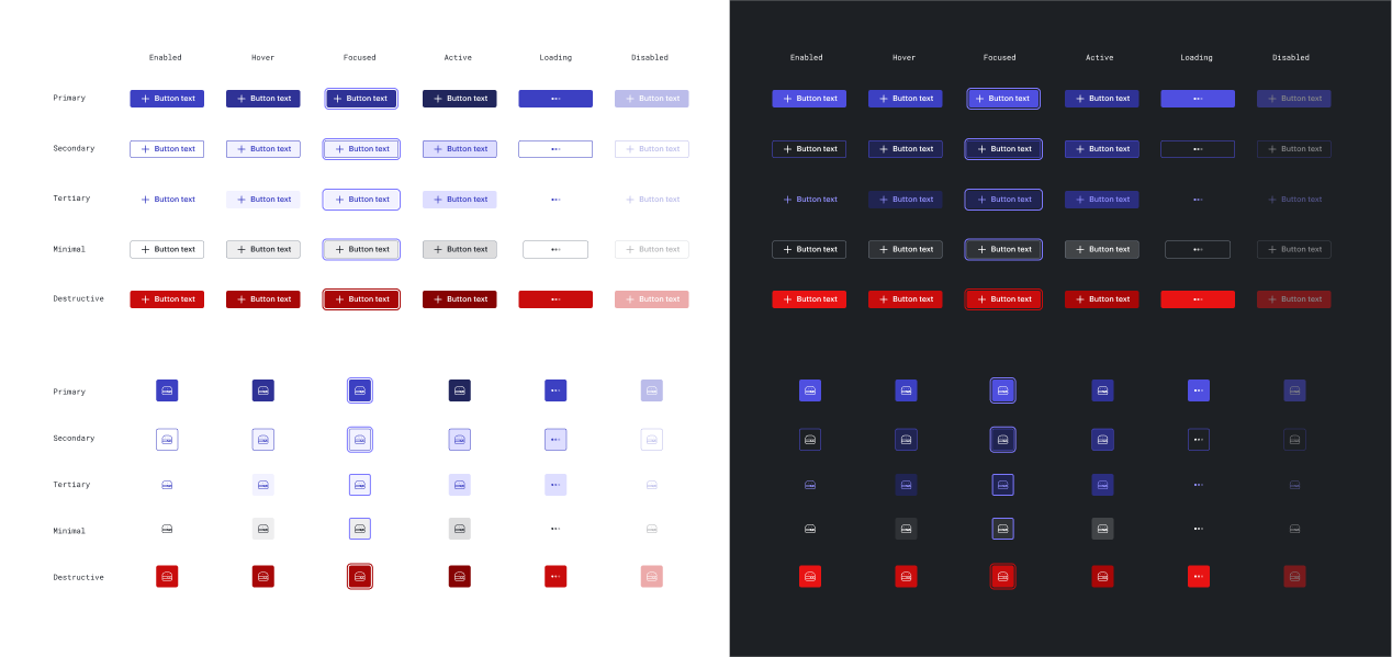
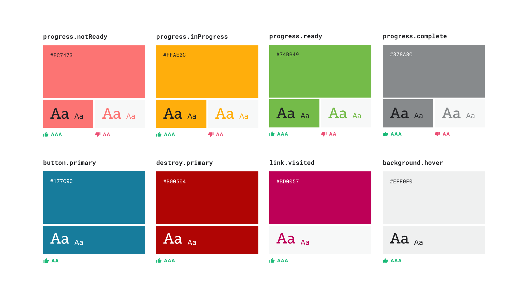
Strata Button and Icon Button: states, emphasis, and light/dark mode theming.

Figma components
We refactored all of the Figma components to include Autolayout, Variants, Props, interactions, theming, spec for keyboard focus order, animations and an intuitive structure.
In order to ensure a high quality experience for UX designers consuming Figma library components, we managed updates with branching/merging. We also set up a "canary file" to test the Figma components when publishing an asset library update.

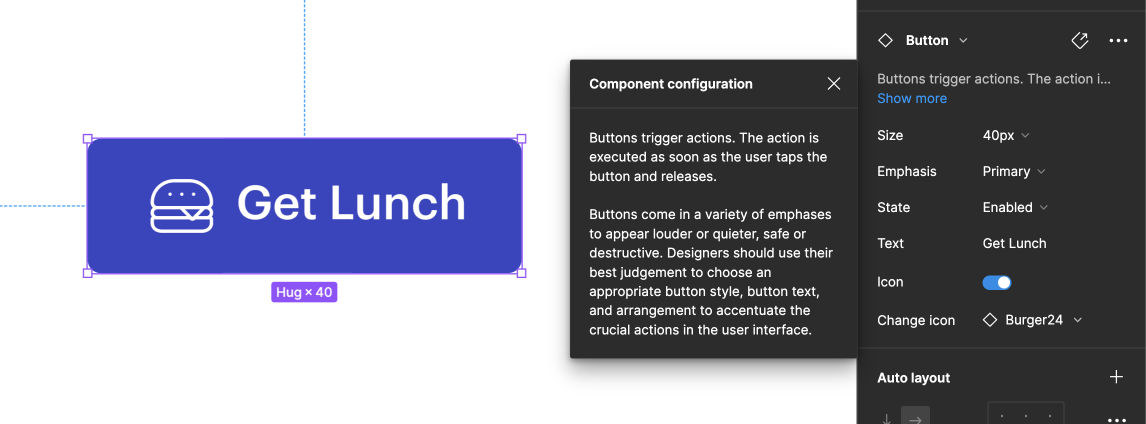
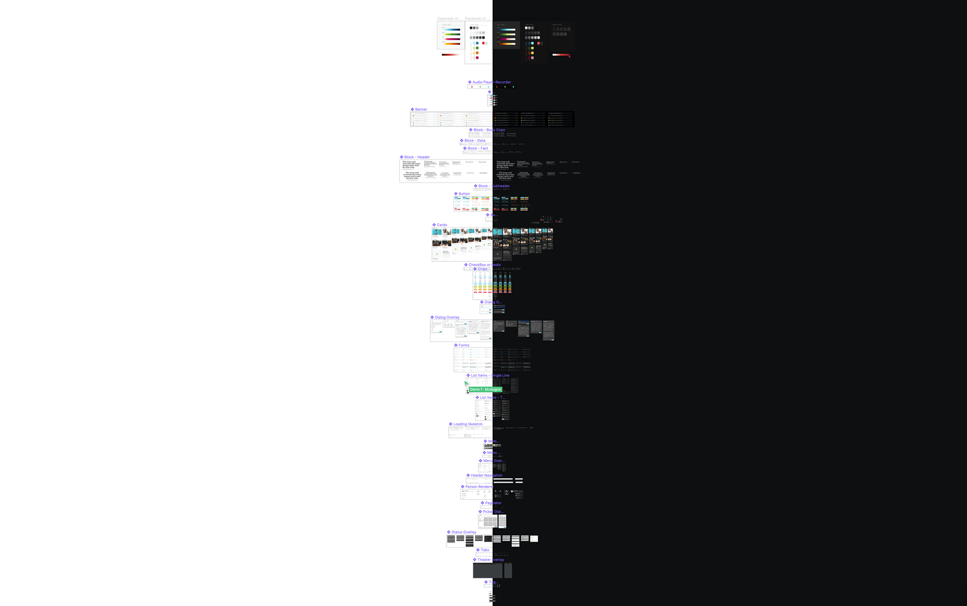
Under the hood of the Button Figma component including: variants, props, auto layout, an intuitive structure, component definition and guidelines.

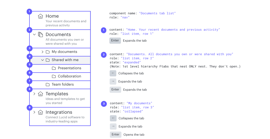
Side Tabs component, keyboard focus order spec

Component states are all wired up so designers inherit all the hover and pressed interaction animations instantly and for free when they use the asset library.

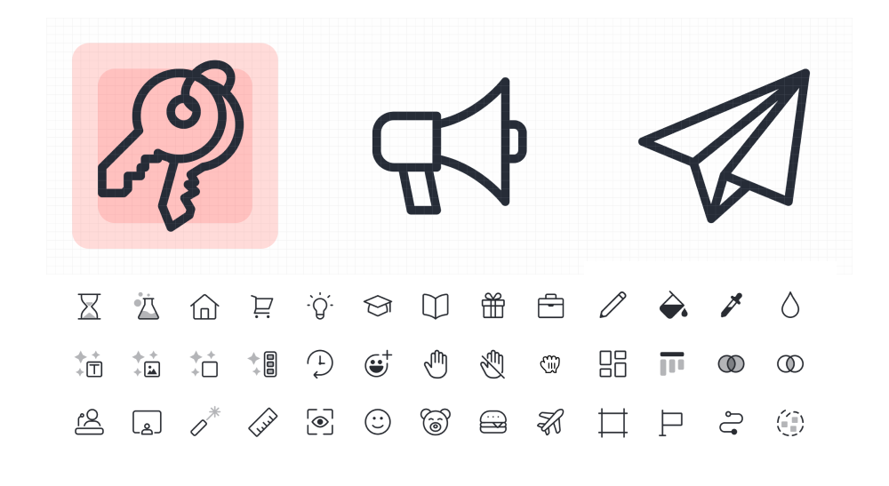
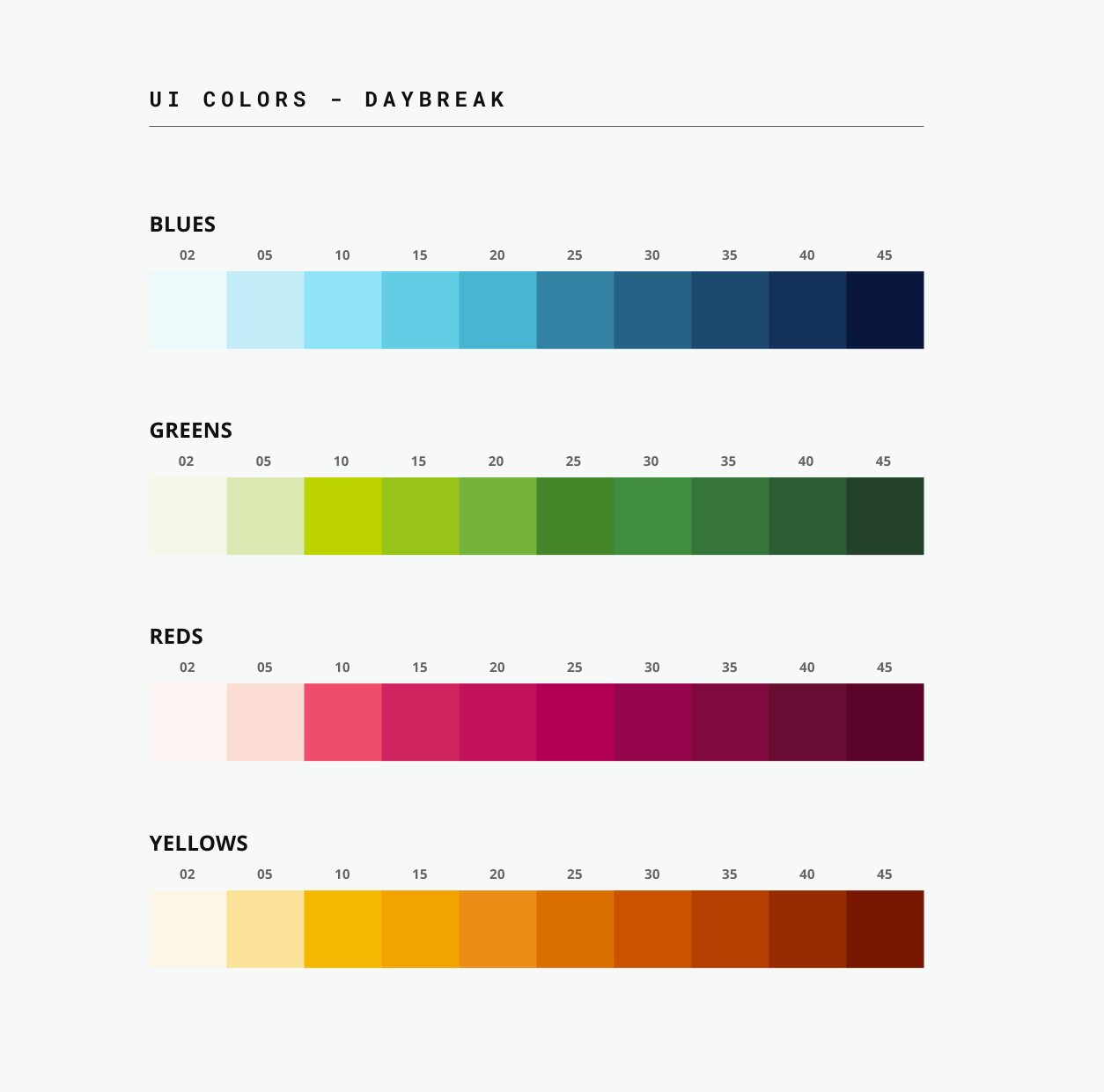
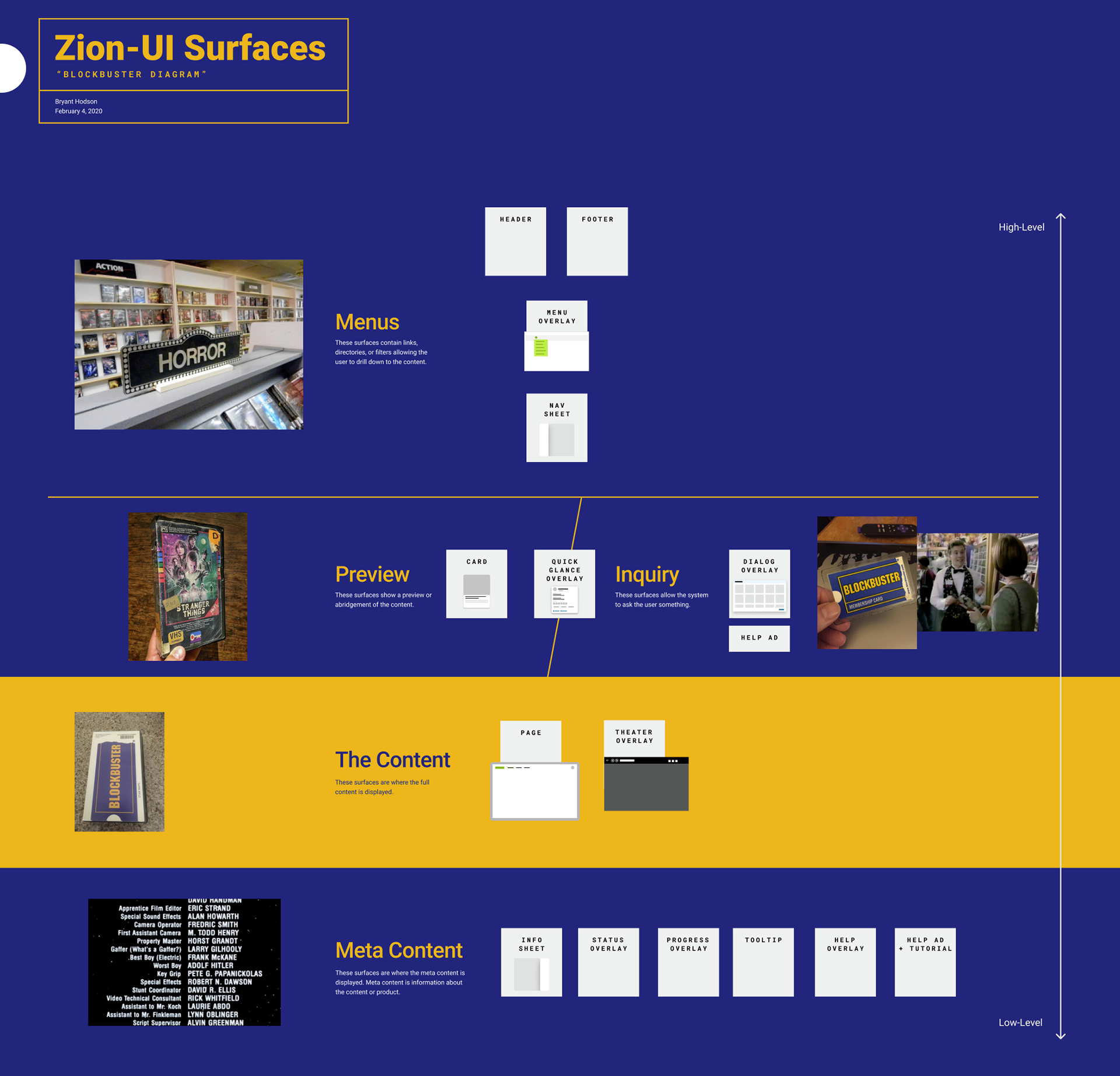
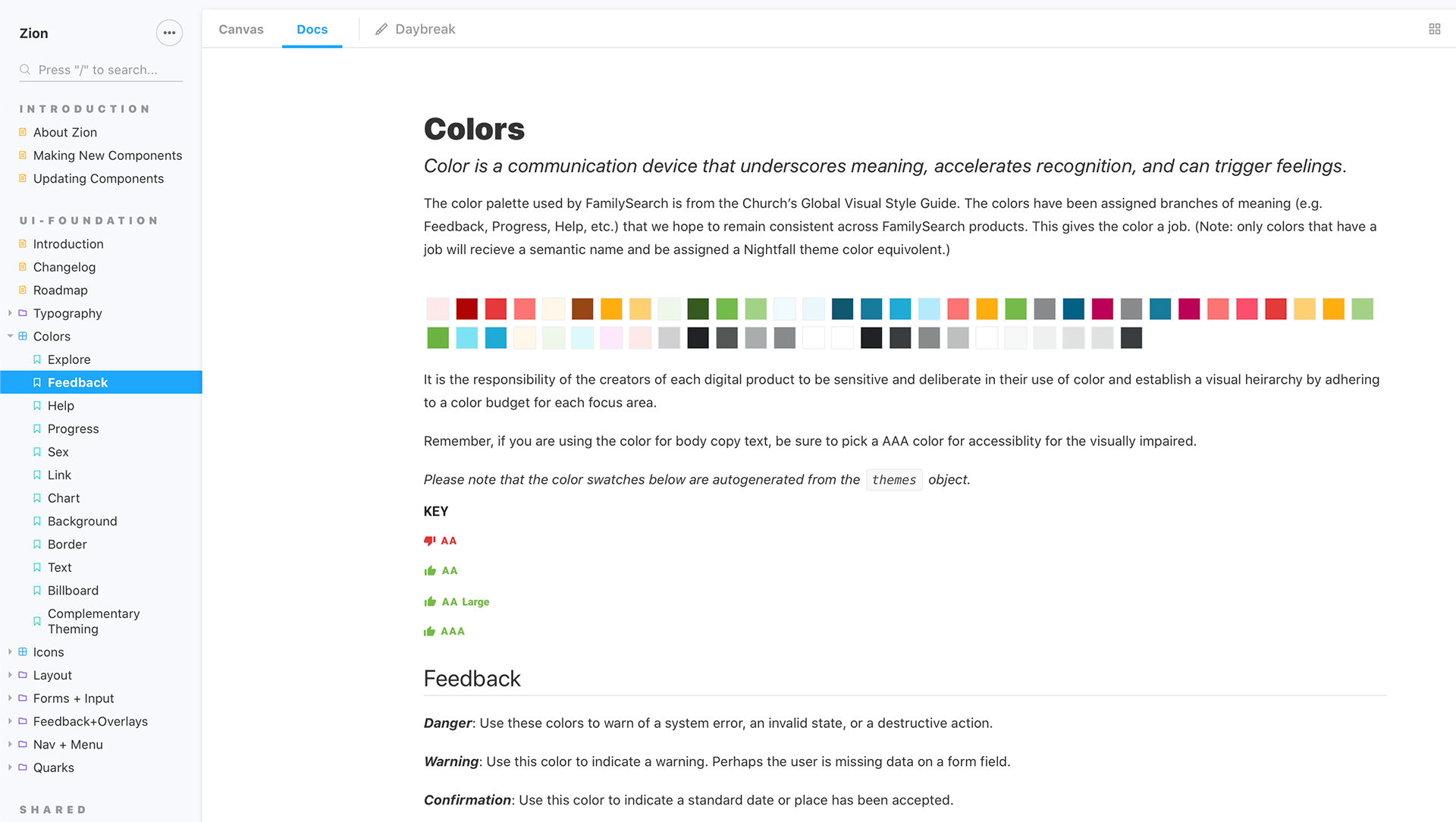
Sample of the Strata icon library.

Governance process
If a design system is a garden, the governance process is the sun, air, and soil. Without a plan for governance, the design system cannot thrive.
• To communicate updates to teams, we... send a monthly Strata newsletter to the entire product development division, present updates in a quarterly tech talk to all of engineering, and give Strata release highlights in the monthly UX team meeting
• To incentivize consistency, we... established consistency metrics in the code. Use of deprecated components and tokens bring down a team's consistency score. Product and Dev leadership use consistency metrics as one way to measure team effectiveness.
• To gauge design system effectiveness, we... run a quarterly employee survey about Strata, hold regular internal interviews to understand better what teams expect from the design system, and run A-B tests to measure the effectiveness of modified components.
• To garner alignment on key decisions, we... hold open, collaborative forums as needed to discuss proposed widespread changes, to review user research insights, and address concerns. We give final decision-making authority to one person in the room: Lucid's director of design. This keeps us moving forward, instead of getting blocked in a paralysis of group decision-making.
• To encourage contribution by all, we... recognize those who contribute to the design system by sending them exclusive patches, provide the opportunity for all UX designers to join the Strata "Satellite Crew" dedicating two weeks to working on a design system-related project of their choice, and have an open task board that anyone can add design system requests to.
• To onboard new designers to Strata, we... have each new hire spend their first month in "Space Camp" working on the design system team, building a component in Figma, and publishing it at the end of the four weeks. This helps them to become familiar with the established patterns and know how to confidently contribute to the design system in the future.

Those who contribute to Strata, receive an exclusive patch from the design systems team.

__________________________________________________________

Zion
Design Leads: Bryant Hodson, Ferenc Petho, Curtis Barlow
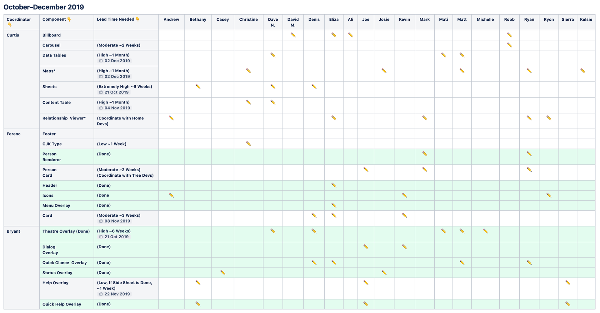
Design: Kevin Dewey, Denis Modugno, Andrew Hair, Bethany Bateman, Casey Robinson, Christine Chiang, Dave Nay, David Matayoshi, Eliza Jensen, Alison Smith, Joe Martel, Josie Morris, Mark Gowans, Mati Collings, Matt Spencer, Michelle Barber, Robb Perry, Ryan Plumb, Ryon Bazzle, Sierra Sahleen, Jake Kenning, Pei Shu
Dev Leads: Matthew Larson, Zach Williams, Kyle West, Derrick Craven
Dev Architect: Gabe Dayley
Managers: Jeff Hawkins, Brian Edwards
ZION is FamilySearch's proprietary design system, spanning all of the organization's customer-facing web apps and web-based digital products.
Although the catalyst for this monumental design+dev effort was a stack update to ReactJS, it was ultimately fueled by our team's desire to have our ecosystem of digital products better meet the needs of beginners through improved consistency and integration.
“It is proper integration that transforms the complicated into complex and understandable.”
A quick birds-eye view tour of the Zion design system as it lives in Figma.
An International Typeface
FamilySearch.org is increasingly visited by users across the world and is translated into a variety of languages. Noto Sans is an ideal choice as the primary typeface for Zion UI because of its vast language support—supporting 582 languages in 237 regions all with "a harmonious look and feel".
Type Block
To improve hierarchy and consistency of type styles across FamilySearch, we developed a set of components that we call Type Block. Type Block is a set of default type pairings with baked-in spacing and hierarchy.
Color
Color is a communication device that underscores meaning, accelerates recognition, and can trigger feelings. In Zion, colors were assigned branches of meaning to be used consistently throughout FamilySearch.
Screenshot of Figma components—Daybreak (left) and Nightfall (right) themes
Standard vs. Billboard
Component design should be informed by the component's context. To allow for the same component to be used in several different contexts, we built-in some pre-configured style variations. 
"Standard" styles are optimized for 'doing work' within an app with compact spacing and smaller type. "Billboard" styles are tuned for content consumption with more comfortable spacing, larger type, and being more image-forward. This allows for both marketing pages and core applications to share the same components with a similar look-and-feel but be appropriately configured for their context.
Understanding Overlays
To better promote cross-product UI consistency, we provided a set of overlays with specific purposes instead of a set of general purpose modals and menus. This also helped to cut-back on the ubiquity of 'favorite designer patterns' that can actually be quite interruptive to the user such as dialogs and alert banners.
The "Blockbuster Diagram" is a visual aid to train others on how each Zion Overlay, or surface, is to be used.
Organizational Breakthroughs
A design system is at the service of the product teams that use it. This is not FamilySearch’s first attempt to have a common style guide and shared set of components. With a design system of this scale and scope, design tends to be the most straight-forward part; often the biggest challenges are in its application and adoption. Our Zion team worked hard to address process challenges early-on. These were some of our solutions:
• To ensure that the design system stays alive and maintained, we established a dedicated team to be stewards of the system. This is a full-fledged engineering team including PM, QA, UX, and Dev because a design system is a complex, full-fledged product.
• To get buy-in, to train, to get a range of perspectives, and to increase velocity of the team, we gave component assignments to designers and devs outside of the design system team.
• To keep the wider organization in-the-loop about new stuff that is introduced into the design system, we set up a bi-weekly 'share and tell' meeting with devs, designers, and product managers.
• To establish a clear path to approval for making changes to the design system, we put one person in charge of final approval for the design of new components and one dev in charge of the final approval of its coded implementation.
• To keep product quality high and ensure proper use of the design system components, we conduct design reviews—pre-dev and pre-launch.
Process

The kickoff meeting with devs, ux, and pm to paint the vision of where we wanted to go with a design system and to discuss early questions/concerns.

Our design process began with a site-wide audit of styles. We screenshot everything, outlined individual components, and tried to identify how each component might fit into Google's Material Design vocabulary.
Design assignments were issued to the entire UX team. They worked together in small groups.
Our design team used Figma to collaborate on drafting up specs for component design.
Design leads established a template in Figma to give the UX team a framework—a suggested process and documentation layout.
Determining typeface styles, sizing, and spacing on different devices.

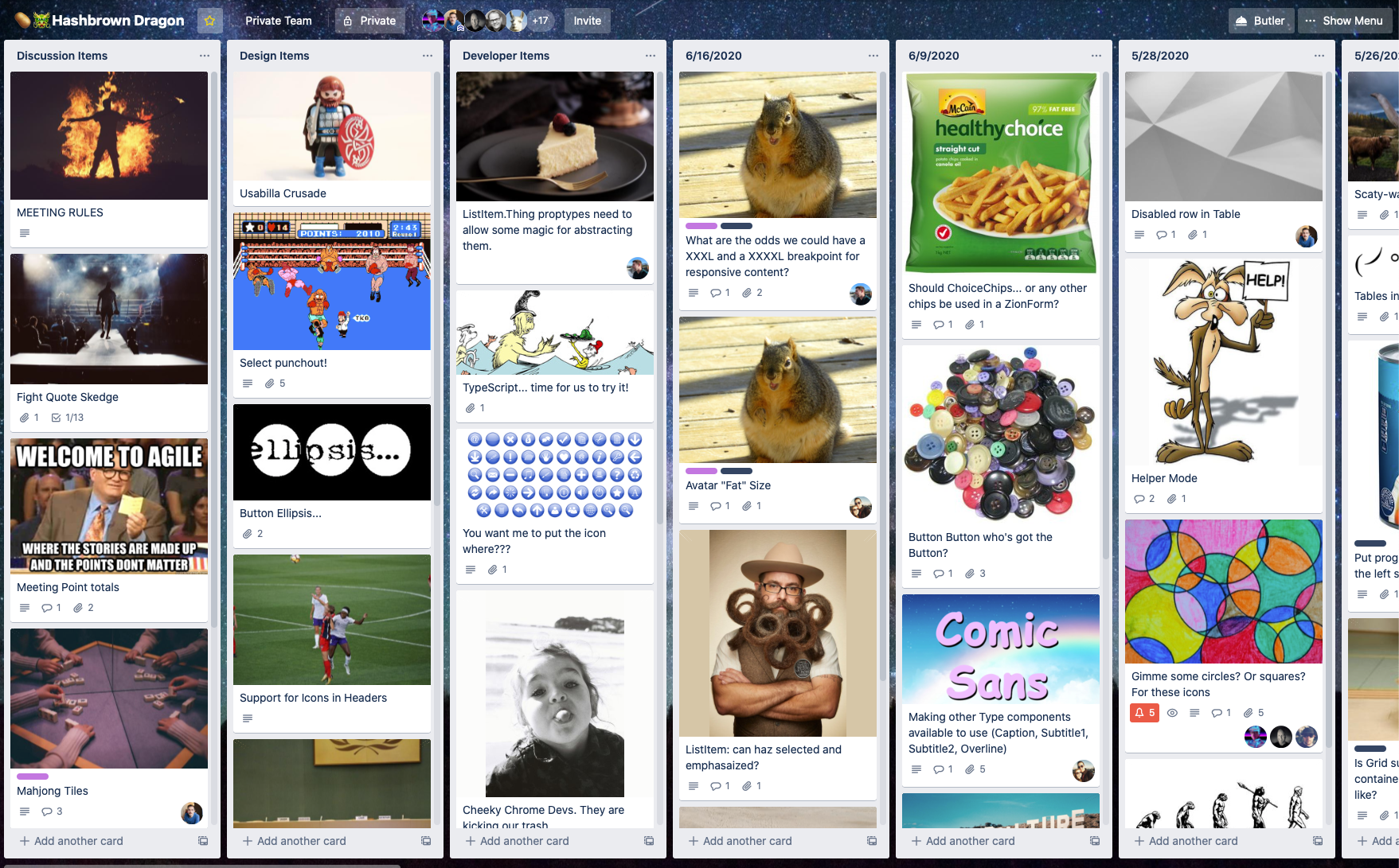
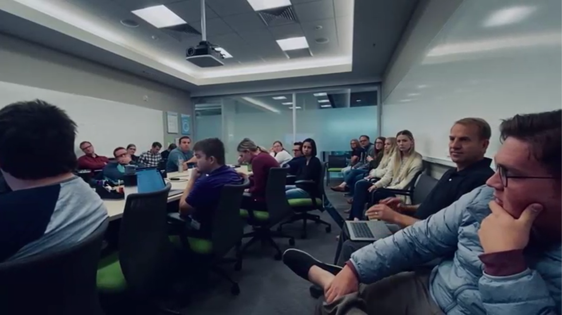
Twice a week, the Zion team of designers and developers runs a "Hashbrown Dragon" meeting to hash out and resolve questions, proposals, and concerns so that the design system doesn't get brittle and rot. Since we are dealing with aspects of our work that aren't working, we try to keep the meeting feeling really fun with off-the-wall memes, a totally arbitrary point rewards system, and a soundtrack provided by attendees.

Design docs, developer docs, and component previews/demos were brought together on Storybook as a 'single source of truth'.

More

Back to Top